Reading: Graphing and Numerical Solver
Graphing Data
One of the most helpful tools in Excel is the chart feature. This allows us to see trends in data, compare variables, and visualize the values in our data set. This can be hard to do by hand, and Excel makes it much easier! Let's walk through how to graph a given data set.
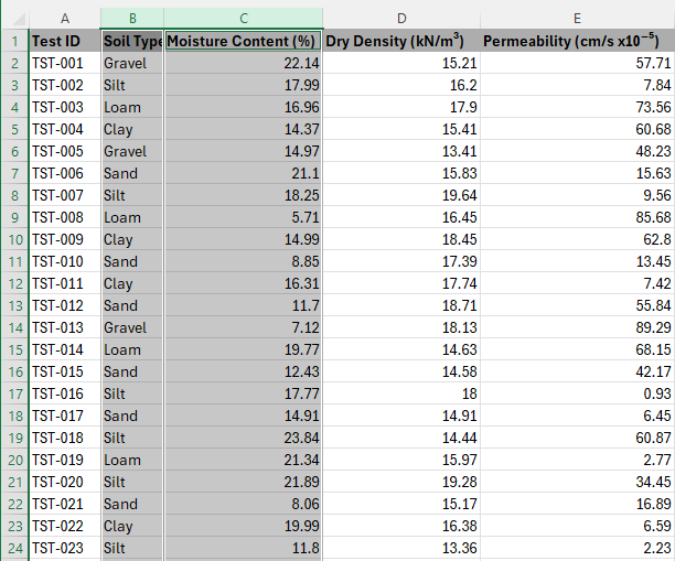
- Highlight the data that you want to graph. Sometimes you don't need all the data, so only highlight what you need. In the example below, there is too much information for the desired graph so only the needed columns were highlighted.
- Select Insert > Chart
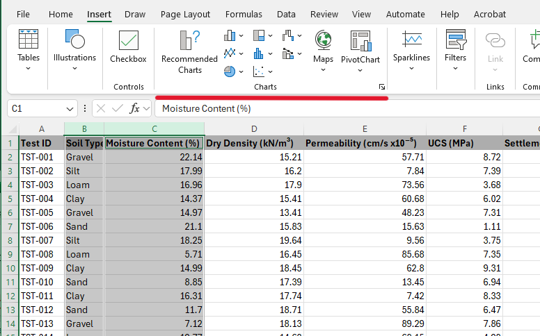
- From here, Excel offers a large variety of options for a graph that suits your data. There is even an option for Recommended Charts, which will automatically select the best graph for your data set. This is a great option if you are unsure which type of graph to use. For this class, we will primarily use line, bar, column, and pie charts. A Bar chart is shown below:
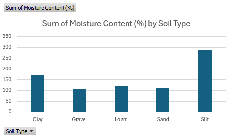
- After selecting the type of graph you want, Excel will create a graph based on the data you highlighted. You can then move the graph to a new sheet by right-clicking on the graph and selecting Move Chart. This will allow you to have a clearer view of your data and graph.
- If you would like to edit the graph, you can do so by clicking on the graph and selecting the Chart Design tab. This will allow you to change the chart type, add chart elements, and change the chart style.
- If you would like to switch the x and y-axis, you can do so by selecting Select Data (or right-clicking the chart and choosing Select Data). This will open a new window where you can change the data for the x and y-axis.
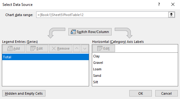
- From here you can change the data for the x and y axes and switch rows and columns. There is also a Switch Row/Column option in the Chart Design ribbon that is useful when you have to make a quick change to the data.
- One of the other useful tools in the Chart Design tab is the Add Chart Elements tool. This allows you to add or remove elements from the graph such as a title, labels, and legend.

- A trendline can also be added to the graph by selecting Add Chart Elements > Trendline. This will add a trendline to the graph that shows the overall trend of the data. It can be added to a scatter plot to help visualize the relationship between the two variables.
- Similarly, if you click on the chart, there are icons next to the chart that have the same functions, Chart Elements, Chart Styles, and Chart Filters. These icons have the same tools as the Chart Design tab, but which can sometimes be more convenient.
- Chart Styles allows the user to change the style of the chart and the colors of the chart. Chart Filters allows the user to filter the data that is displayed in the chart. This can be useful if you want to focus on a specific subset of your data.
- If you would like to change the font, size, and color of the text in the graph, you can do so by clicking on the text you would like to change.
These are just a few ways we can organize and format our graph to help us better see patterns and trends in data. Other types of graphs have more unique features to them, but these are the general few!
Specific Examples
When organizing data, we are often looking for the most effective way to visualize it. Below are a few examples of specific graph types and how they're commonly used.
Line Graph
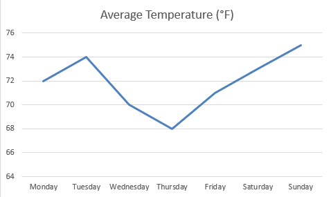
Line graphs are used to show trends over time. They are useful for showing how a variable changes over a period of time, such as sales or temperature.
Bar/Column chart
Bar and column charts are used to compare values across different categories of data. They are useful for showing the differences between groups, such as sales by region or product.
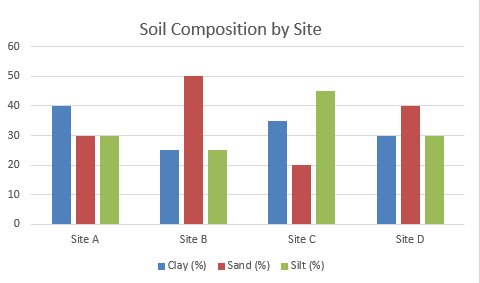
Bar charts are horizontally oriented and typically used for categorical data, while column charts are vertically oriented and used for numerical data.
Pie Chart
Pie charts are used to show the proportion of different categories in a whole. They are useful for showing how a variable is divided into different parts, such as market share or budget allocation.
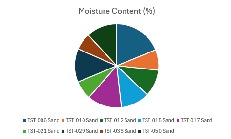
This pie chart shows the amount of moisture content in different types of sand. Each slice represents a different type of sand, and the size of each slice represents the proportion of moisture content in that type of sand.
Scatter Plot
Scatter plots are used to show the relationship between two variables. They are useful for showing how one variable affects another, such as the relationship between temperature and sales.
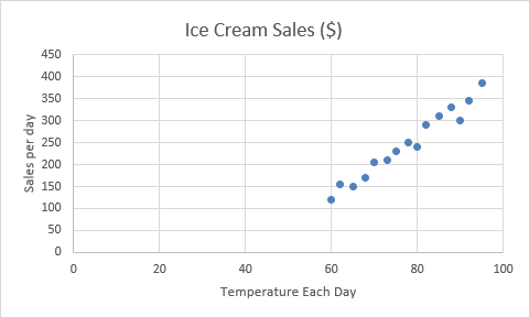
This scatter plot shows the relationship between temperature and ice cream sales. Each point represents a different day, and the position of each point shows the temperature and sales for that day.
There are many other types of graphs that can be used to visualize data, such as area plots (the area under the line is filled), funnel charts, and radar charts. Each type of graph has its own strengths and weaknesses, and the best type of graph to use depends on the data you are working with and the message you want to convey.
Here is an extra resource for further examples of graphing: Available chart types in Office
Solver in Excel
The Solver is a powerful tool in Excel that allows you to find an optimal value for a formula in one cell, by adjusting other cells and adhering to constraints. The Solver can be used to find the maximum or minimum value of a formula by changing the values in the cells that are referenced by the formula.
It can be used for various purposes, such as optimization problems, resource allocation, and financial modeling. The solver can handle linear and nonlinear problems, making it a versatile tool for data analysis. You can use the solver to find the maximum profit for a business within constraints, choose an optimal budget allocation, or minimize costs in a project. Solver is pretty cool!
How to add Solver in Excel
To enable the Solver Add-in in Excel (it is not enabled by default), follow these steps:
- Go to File > Options (found near the bottom of the left-hand menu).
- In the Excel Options window, select Add-ins from the sidebar.
- At the bottom, in the Manage dropdown, select Excel Add-ins, then click Go
- In the Add-Ins available box, check the box next to Solver Add-in.
- Click OK to enable it.
After you load the Solver Add-in, the Solver command is available in the Analyze group on the Data tab. These steps only need to be completed once. If you do not see the Solver option in the Data tab, you may need to restart Excel after enabling the add-in.
Note
You may notice that there is a Solver option in the Home tab. This is a different solver that is used for solving equations, not for optimization problems. The Solver in the Data tab is the one we will be using in this class.
Example Problem
The following workbook demonstrates how to use the Solver. You are the owner of a soil testing business, and you are trying to calculate the cost per test that will allow your company to pay off a $25,000 piece of soil testing equipment in exactly 12 months, given they expect to perform 40 tests per month.
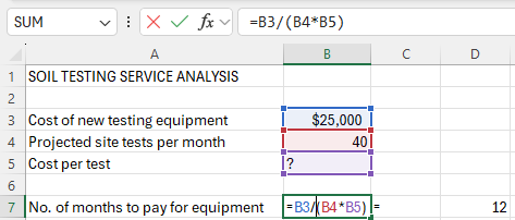
To open up the solver we go to Data > Analysis > Solver
In general, the Solver is like Goal Seek in that it iteratively changes one (or more) input cell(s) until some condition is met. However, Solver allows for three possible objectives—maximising, minimizing, or setting a specific value—and lets you define a set of constraints. When we use the Value Of option, it is essentially the same as Goal Seek. We are going to change Set Objective to the cell that contains the number of months it will take to pay off the equipment, which, in this case, is cell B7.
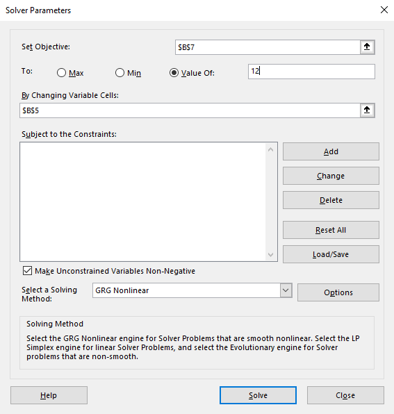
The Set Objective cell is the cell containing the formula that represents the objective of the problem, or the result that you're trying to optimize. In this case, it is the cell that contains the cost per test.
The By Changing Variable Cells are the cells that the solver will change to find the optimal solution. In this case, it is the cells that contains the number of projected site tests per month and cost per service.
The Subject to the Constraints section allows you to add constraints to the problem.
The Select a Solver Method dropdown lets you choose how Solver will find a solution. The default option, GRG Nonlinear, is used for nonlinear problems. The Simplex LP method is used for linear problems, and the Evolutionary method works best for problems that are hard to define or have sudden changes in the data. In this class, we will primarily use the GRG Nonlinear method, as it is the most versatile and works well for most problems.
Using the options shown above, we can solve for by clicking the Solve button. Doing so brings up the following message:
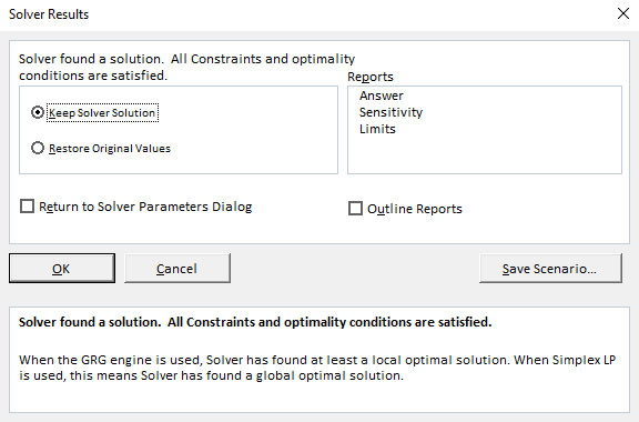
Generally you want to select the OK option to keep the solver solution. The solution found by the solver is: $52.08
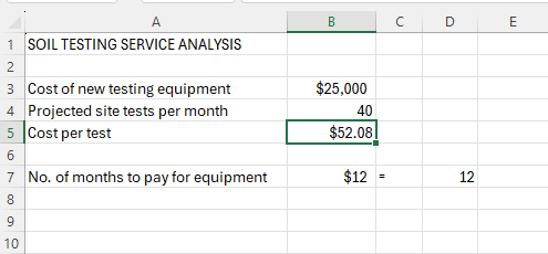
The real power of the solver is performing optimization using the Max and Min options. This is something that cannot be done with Goal Seek.
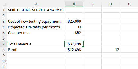
For example, suppose we wanted to find the maximum number of months it takes to pay off equipment without changing the price. We might as well input our Total revenue and Profit to see how it affects our data. We can do this by changing the Set Objective to Max, and adding the constraint that the site tests per month is not greater than 60. To add a constraint, click Add > input your Cell Reference and the Constraint. As the Solver iterates, a variety of input values are tested. Such constraints can ensure that the Solver algorithm stays stable and will be more likely to converge on a solution.

We then click the Solve button again. The result is shown below:
Additional Readings
This is just a sample of the many things you can do with a solver. It is easy to use and can be extremely powerful and convenient. Here are some additional resources that you may find helpful:
Pre-Class Quiz Challenge
Exercise #1 - Graphing Sales Data
The starter workbook can be found here: (Starter-Workbook)-Pre-Graphing-and-Solver.xlsx
Make sure to rename the starter sheet something like “(Your Name)-Pre-Graphing-and-Solver.”
In this workbook, we are going to be focusing on three main sheets: "Sales_Data", "Graphing", and "Topo-Solver."
Navigate to the "Sales_Data" sheet in the starter workbook. This data contains sales information for an engineering surplus store. The data includes the month, region, product, units sold, unit price, and total sales. You are the employee tasked with creating graphs to visualize this data.
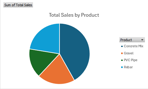
First, your boss wants you to create a pie chart that shows Total Sales by Product. Your end result should look similar to this:
Hint!
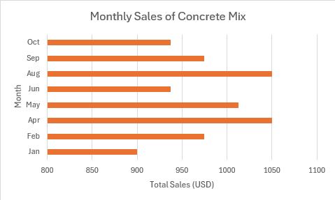
it may be helpful to use a Pivot Table to summarize the data first...Your boss would also like to see a bar graph that shows the Monthly Sales of Concrete Mix You should end up with a graph that looks similar to this:
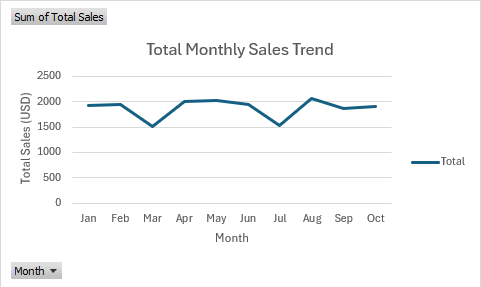
Finally, to visualize any trends in the data, your boss wants you to create a line graph that shows the Total Sales by Month. Your end result should look similar to this:
Make sure that all graphs have appropriate titles, axis labels, and legends.
Exercise #2 - Topographic Map
Navigate to the "Topo_Solver" sheet in the starter workbook. You need to create a topographic map of a hill range for a project. Your team successfully created a function that accurately returns accurate elevations given horizontal distances, and now wants you to find the exact coordinates for certain points of interest (Depression 1, Peak 1, etc.). The local minimums of the function represent the depressions of the hill range, and the local maximums of the function represent the peaks of the hill range.
- Use Solver to find the locations of each depression. Set objective cell B4 to Min by changing variable cell A4. Then, add the constraints specified for each depression in cells B7:B10 (For example, to find Depression 1, add the constraints A4>=200 and A4<=350). Once solved, copy the solutions and paste them under the "Horizontal Distance (ft)" and "Elevation (ft)" columns. Make sure that you paste as values only to avoid pasting the formula by mistake.
- This time, use Solver to find the locations of each peak. Set objective cell B4 to Max by changing variable cell A4. Then, add the constraints specified for each peak in cells B11:B13 (For example, to find Peak 1, add the constraints A4>=400 and A4<=450). Once solved, copy the solutions and paste them under the "Horizontal Distance (ft)" and "Elevation (ft)" columns. Again, make sure that you paste as values only to avoid pasting the formula by mistake.
Turning in/Rubric
REMINDER - For this class, you will only turn in the links to your Excel files. You will get a 0 for this assignment if you turn in an Excel file or a link that is not shareable.
- On the top right, click the share button --> share --> settings
- Click "anyone" at the top, then underneath "More settings", change "can view" to "can edit". Then click apply.
- Copy the link, then turn it into Learning Suite in the feedback box for this assignment.
Rubric:
| Item | Points Possible |
|---|---|
Total |
3 |
The following is not a part of the rubric, but specifies how you can lose points. For example: if you fail to share your link correctly.
| Reasons for Points Lost | Amount |
|---|---|
| Link shared incorrectly | -10% |