Reading: Matplotlib
Pre Class Reading Assignment
In the Python Data Science Handbook, read the following chapters:
Visualization with Matplotlib (Part 4)
Chapter 25: General Matplot Tips
Chapter 26: Simple Line Plots
Chapter 27: Simple Scatter Plots
Chapter 29: Customizing Plot Legends
Chapter 32: Text and Annotation
There is also a chapter in the Python Crash Course book, that book we used for the introduction to python part of the course, that you should read:
Remember that you will have to sign in to your free account that you created earlier.
You may want to read Chapters 35 (3D ploting), and Chapt 36 (Using Seaborn) for interesting and pretty plots. Seaborn is a library that is built on top of Matplotlib, that provides a number of useful functions for creating plots.
Things to Look Out For
- How to create line, scatter, and histogram plots.
- How to add titles and axes.
- How to style plots.
Two Interfaces to Matplotlib
As noted in Chapter 25 of the Python Data Science book, Matplotlib provides two interfaces to plotting data:
- A simple MATLAB-style interface that is provided by the
pyplotmodule. - An object-oriented interface that is provided by the
FigureandAxesclasses.
The pyplot interface is a state-based interface that is easy to use (looks like MATLAB) . It is
convenient for simple plots, but it is somewhat limited in its flexibility to make it more easy to use.
The object-oriented interface is more powerful and flexible, and it is recommended for more complex plots, especially those involving multiple subplots.
In this course, we will primarily use the pyplot interface (the easy one) because it is simpler and works great for most plots. In
the reading,
you will see examples of both interfaces. You are welcome to use the object-oriented interface if you prefer. You can also mix the two interfaces, start with the easy pyplot interface, then add details and customizations using the object-oriented interface.
Here is an example of how to use the object-oriented interface (more powerful) to create a simple line plot. You create an Axes object which we call ax in this example, then call methods on the object to create the plot and add labels, a title, and a legend.:
import matplotlib.pyplot as plt

ax = plt.axes()
ax.plot([1, 2, 3, 4], label='Line 1')
ax.set_xlabel('x axis')
ax.set_ylabel('y axis')
ax.set_title('This is a simple line plot')
ax.grid(True)
ax.legend()
This is how you would create the same plot with the pyplot interface. Here we just issue a number of commands to create the plot and add labels, a title, and a legend. These commands work on the current figure and axes. With the object-oriented interface, you explicitly create the figure and axes objects and call methods on them.
import matplotlib.pyplot as plt

plt.figure(figsize=(6, 4))
plt.plot([1, 2, 3, 4], label = 'Line 1')
plt.xlabel('x axis')
plt.ylabel('y axis')
plt.title('This is a simple line plot')
plt.grid(True)
plt.legend()
plt.show()
Note the similarities between the two examples. Both examples result in the following plot:
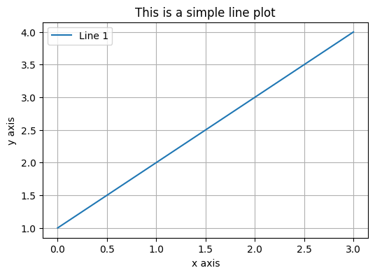
One of the advantages of the object-oriented interface is that it allows you to create multiple subplots in a single figure. Here is an example of how to create a figure with two subplots:
import matplotlib.pyplot as plt

fig, ax = plt.subplots(2)
ax[0].plot([1, 2, 3, 4], label='Line 1')
ax[0].set_ylabel('y axis')
ax[0].set_title('This is a stacked line plot')
ax[0].grid(True)
ax[0].legend()
ax[1].plot([4, 3, 2, 1], label='Line 2')
ax[1].set_xlabel('x axis')
ax[1].set_ylabel('y axis')
ax[1].grid(True)
ax[1].legend()
Which results in the following plot:
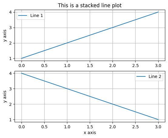
There is a way to do the same thing with the pyplot interface, but it is a little more complicated. The object-oriented interface is more straightforward for creating multiple subplots.
Bar Charts
The examples create line plots using the plot function. However, you can
also create bar charts with the bar function. Bar charts are useful for comparing quantities across different categories. You can create a bar chart by calling the bar function with two arguments: a list of x-values and a list of y-values. The x-values are the categories, and the y-values are the quantities.
Here is an example of how to create a bar chart:
import matplotlib.pyplot as plt

plt.bar(['A', 'B', 'C', 'D'], [1, 2, 3, 4])
plt.show()
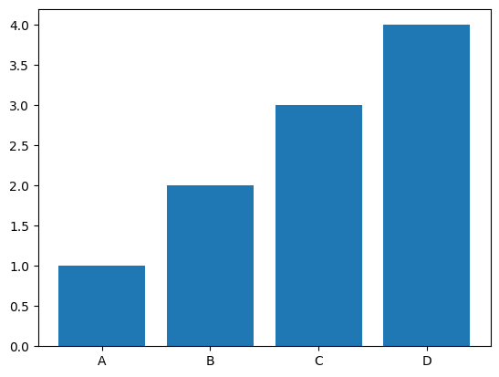
To do a horizontal bar chart, you can use the barh function instead of the bar function. You will be asked to do both types of bar charts in the in-class exercise.
Annotations
Annotations are described in Chapter 32 of the Python Data Science book. Annotations are text or arrows that you can
add to a plot to provide additional information. In Chapter 32, all of the examples are based on the object-oriented
interface. This is the best reference for your HW and in-class. However, you can also add annotations with the pyplot interface as follows and you may prefer this method for simple plots:
import matplotlib.pyplot as plt

plt.plot([1, 2, 3, 4])
plt.annotate('This is the middle', xy=(1.5, 2.5), xytext=(0.5, 3),
             arrowprops=dict(facecolor='black', shrink=0.05))
plt.show()
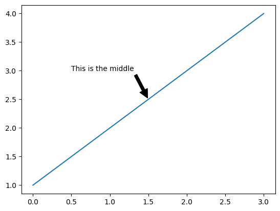
Note that the annotate function takes three arguments: the text of the annotation, the position of the annotation (where the arrow points to),
and the position of the text. The arrowprops argument is optional and specifies the properties of the arrow that
points to the annotation. The xy argument specifies the position of the annotation (arrowhead location), and the xytext argument
specifies the position of the text. Both arguments are in data coordinates.
The function parameters are:
text   : The text of the annotation
xy     : The point (x,y) to annotate
xytext : The position (x,y) to place the text at (If None, defaults to xy)
arrowprops : The properties used to draw an arrow between the positions xy and xytext
Styles (Optional)
You can customize the look of your plots using different styles. Matplotlib comes with a number of built-in styles that you can use to change the appearance of your plots. One popular style is the ggplot style, which is inspired by the ggplot2 package in R. You can also set individual items such as line width, color, grid style, font size, plot size, etc. However, using a style is an easy way to change the overall look of your plots. Usually, once you set a style, it is "permanent" for all plots in your notebook or script.
The with construction makes it a temporary style, rather than a permanent one. You can also use the plt.style.use('ggplot') command to set the style for all plots in the notebook (permanent for your session).
If you set something permanently and want to reset to the default settings use
import matplotlib.pyplot as plt
plt.rcdefaults()
This command will list the styles available in your version of matplotlib:
import matplotlib.pyplot as plt
print(plt.style.available)
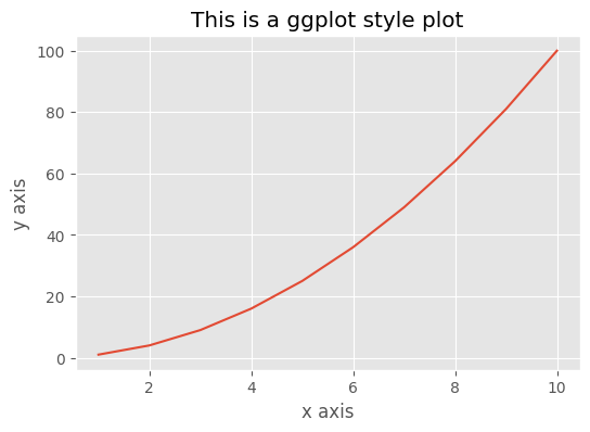
Here is an example that temporally sets the plot style to ggplot using the with construction:
import matplotlib.pyplot as plt
import numpy as np

x = np.arange(1, 11)
y = x**2

with plt.style.context('ggplot'):
    plt.plot(x, y)
    plt.title('This is a ggplot style plot')
    plt.xlabel('x axis')
    plt.ylabel('y axis')
    plt.show()
The plot will look something like this:
Just for Fun (Optional)
One fun style you might want to try is the xkcd function which sets a number of matplotlib defaults.
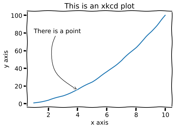
This "style" makes the plot look like it was drawn by hand. Here is an example of how to use the xkcd style.
It is different from other styles as you use the plt.xkcd() function to set things up. You probably want to
use the with construction to make sure that the style is temporary.
import matplotlib.pyplot as plt
import numpy as np
x = np.arange(1, 11)
y = x**2
with plt.xkcd():
    plt.figure(figsize=(6, 4))
    plt.plot(x, y)
    plt.title('This is an xkcd plot')
    plt.xlabel('x axis')
    plt.ylabel('y axis')
    # Define the arrow properties, this is a curved arrow
    # we make the dictionary first, then provide it in the annotate command
    arrow_prop = dict(arrowstyle="->", connectionstyle="arc3,rad=.5",     color="black")

    plt.annotate('There is a point', xy=(4, 16), xytext=(1, 80),
                arrowprops=arrow_prop)
    plt.show()
The plot will look something like this:
If you try this, you will get a lot of error messages because the xkcd function requires fonts that are not
installed on the Colab server.
Try some of your other plots using the xkcd function. You can indent your plot commands as shown above, or just run
plt.xkcd() then replot any of your plots.
However, if you run plt.xkcd() without the with to make it temporary, it sets the style for all plots done
afterwards.
To reset to the default settings use
import matplotlib.pyplot as plt
plt.rcdefaults()
Pre-Class Quiz Challenge
Open this starter sheet and follow the instructions on the notebook to complete the challenge. Submit a link to the completed problem in your Pre-Class Quiz.

Rename it something like "(Your_Name)_Pre_Matplotlib.ipynb"